Merd Stuff: Branding
The Context
Merd Stuff is an independent glass jewelry brand rooted in artistic experimentation and playful exploration of form and material. Closer to an artist's studio than mass production, the brand embraces the unpredictable nature of glass, creating distinctive pieces where individuality and the creative process take center stage.
Client
Merd Stuff
DELIVERABLES
Brand concept Logo design Visual identity system Color framework (open, adaptive use) Typography direction Guidelines
Year
2026
Role
Brand Designer & Motion Designer
The Challenge
The challenge was to position Merd Stuff as a design-driven jewelry brand for an audience that values originality, craftsmanship and is willing to invest in unique pieces. The identity needed to communicate quality and intention without losing the spontaneity that makes the brand distinctive. It had to feel elevated, but never overly polished or conventional.
The Approach
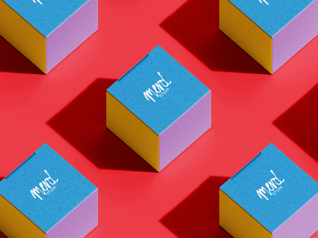
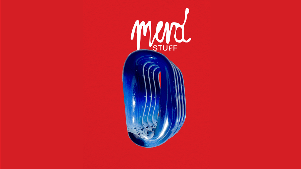
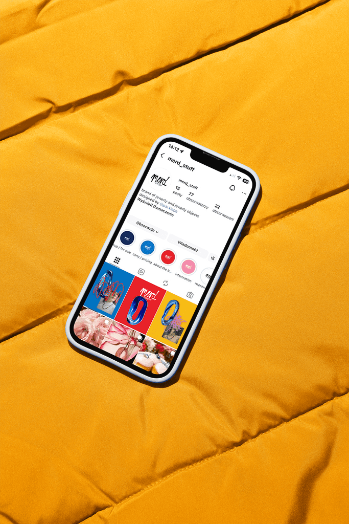
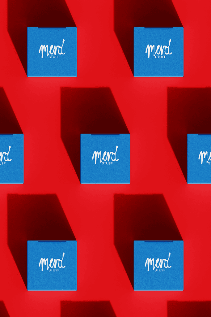
The logo explores the contrast between organic expression and controlled structure, taking inspiration from the fluid, irregular shapes of glass and the unpredictable patterns formed when liquids freeze. The upper part of the wordmark, "merd", was drawn by hand without a construction grid. Its irregular, almost liquid forms reflect the experimental nature of the jewelry and the freedom of the creative process. In contrast, "stuff" introduces a more structured typographic foundation. Subtle shifts and rotations disrupt its regularity, adding a playful character while preserving readability. Together, these two visual languages create a balance between artistic freedom and considered design, allowing the identity to feel expressive and distinctive without compromising its sense of quality.
<iframe src="https://player.mux.com/akNYG00cxeDR8MD5eYAcxcHx00nisqEtMmLXurwoMYra00?muted=true&autoplay=true&loop=true&controls=false" style="width: 100%; aspect-ratio: 16/9; border: none; pointer-events: none;" allow="autoplay; fullscreen" loading="lazy" ></iframe>