FLIV TMS: Brand Identity & System Design
The Context
FLIV is a transport management system (TMS) designed to connect two sides of the logistics process: dispatchers managing operations from their desks and drivers working on the road. By bringing both into one platform, FLIV makes everyday transport management simpler, more connected and easier to navigate.
Client
FLIV
DELIVERABLES
Logo design Visual identity Color palette Typography Graphic & icon system Photography guidelines Social media templates Brand guidelines
Year
2025
Role
Brand Designer
The Challenge
One platform, two very different ways of working. Dispatchers need efficient digital tools to manage complex operations, while drivers need clarity, simplicity and quick access to essential information on the move. The TMS market is filled with similar-looking solutions, often relying on predictable blue color palettes and conventional tech aesthetics. The challenge was not only to create an identity that speaks to both audiences, but also to convince the client that standing out was worth taking a creative risk. The goal was to move beyond industry conventions without compromising the clarity, reliability and trust that users expect from a transport management platform.
The Approach
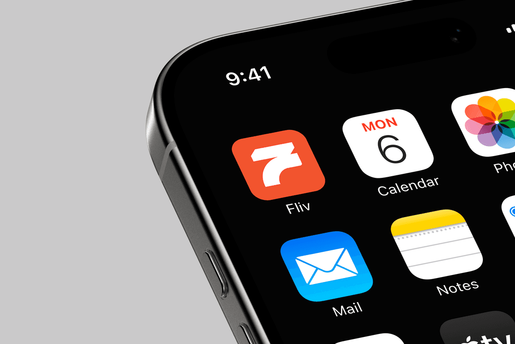
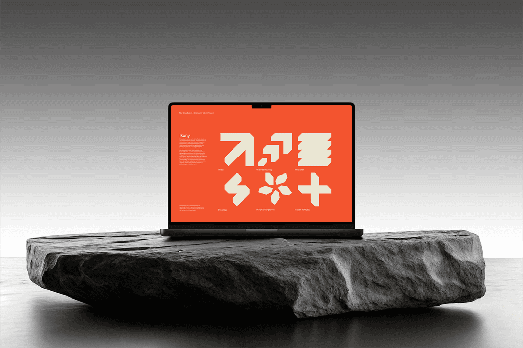
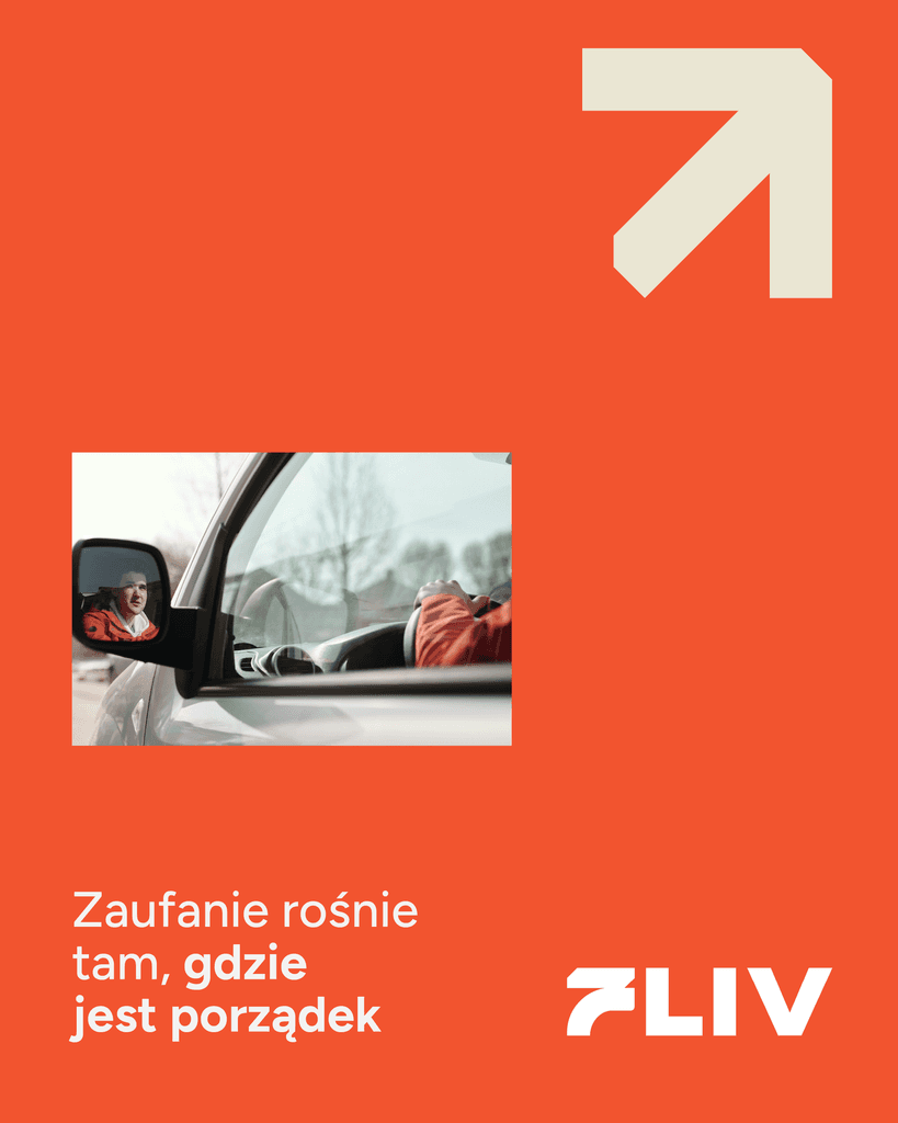
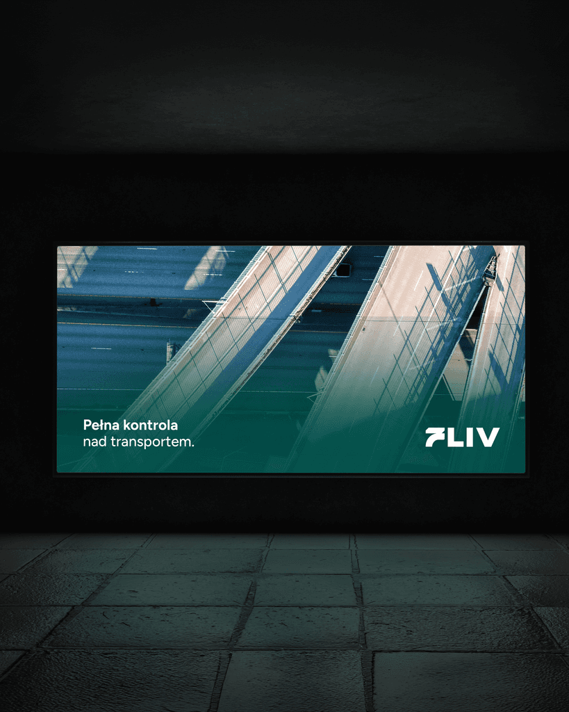
The identity was built around a simple idea: bringing movement and structure together. The logo combines a bold, geometric wordmark with a minimal symbol that subtly references the letter F and a road seen from above. Its solid construction communicates stability, while the simplified form makes it recognizable both as a standalone app icon and as part of the full logo. Color introduces a second layer of meaning. Vibrant orange represents the dispatcher-facing desktop experience, while a softer green is assigned to the mobile environment used by drivers. This distinction creates a clear visual connection between each audience and its part of the platform, while moving away from the conventional visual codes of the transport industry. The same geometric logic extends into a modular icon system. Built on a 4×4 grid, the symbols draw from the shapes of truck trailers seen in perspective, translating key brand values into a flexible visual language. Together, these elements create an identity that feels structured without being rigid, and expressive without sacrificing clarity.
<iframe src="https://player.mux.com/XJrd7zCOQmAHIRqJUwJgY00I00tVmlH76OUKoyKn1z6iY?autoplay=muted&loop=true&muted=true" style="width: 100%; border: none; aspect-ratio: 16/9; pointer-events: none;" allow="accelerometer; gyroscope; autoplay; encrypted-media; picture-in-picture;" allowfullscreen="true" ></iframe>