ATT Logistics: Brand Implementation
The Context
ATT Logistics is a transport and logistics company operating in an industry where reliability, efficiency and clear communication are essential. Following a rebrand, the company needed to introduce its new visual identity across multiple touchpoints, from external marketing to everyday internal communication.
Client
ATT Logistics
DELIVERABLES
Key Visuals set Illustration system Brand tagline Brand guidelines Internal presentation templates Internal communication templates Photography guidelines Team onboarding Brand toolkit
Year
2025/2026
Role
Art Direction
The Challenge
The new brand identity had a strong visual foundation, but the initial guidelines covered only a limited range of applications. As communication needs grew, the existing assets were no longer enough to support the brand across different formats, audiences and occasions. The challenge was not to redesign the identity, but to make it work in practice. This meant expanding its visual language, building brand recognition among employees and creating tools they could use independently. At the same time, the rebrand needed to be communicated externally, with a clearer presentation of the company's services and a consistent presence across marketing channels.
The Approach
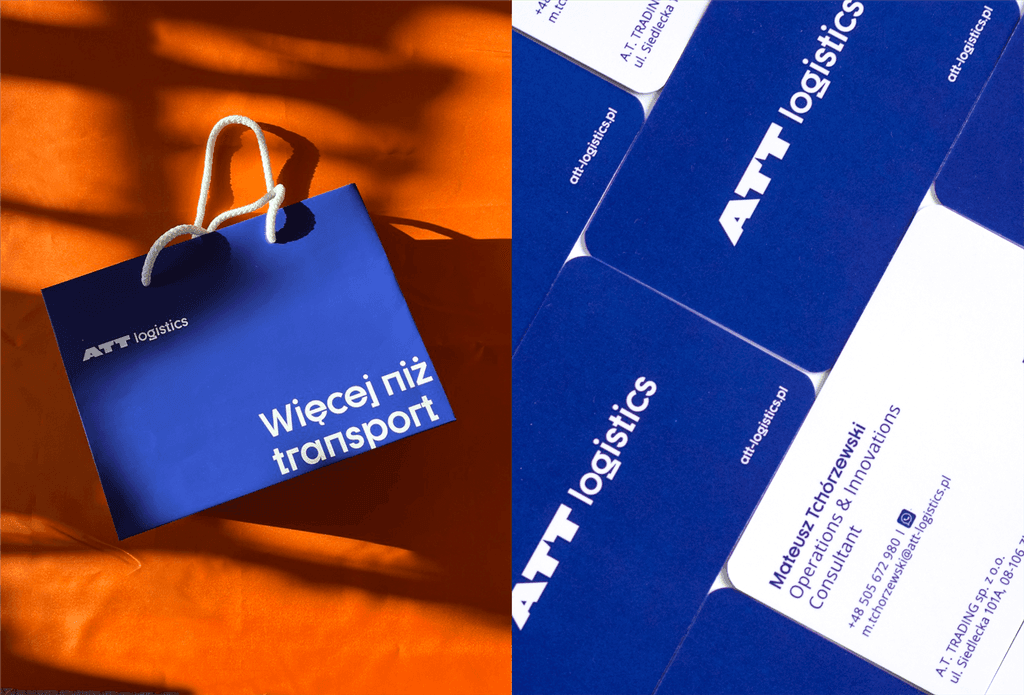
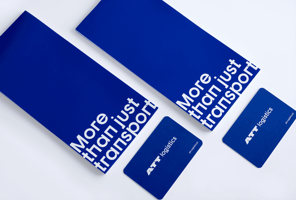
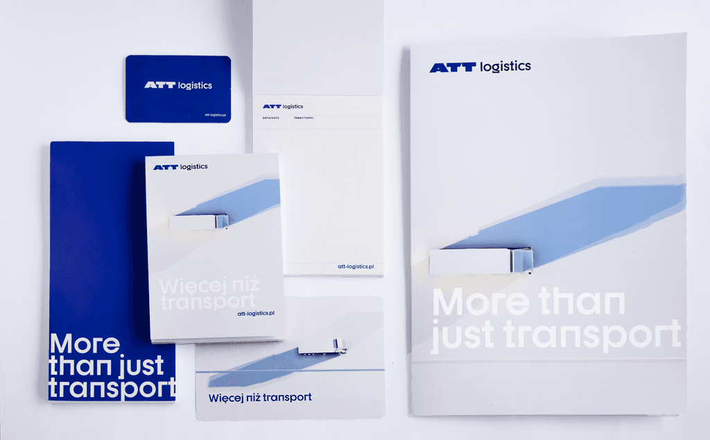
I led the implementation and communication of the rebrand, developing the existing identity into a more versatile and practical visual system. One of the key additions was a new illustrative direction built around a friendly 3D truck character. It introduced a more approachable side of the brand, making room for applications that the original guidelines hadn't anticipated, from holiday greetings to creative activities for employees' children. Internally, I developed a set of accessible, ready-to-use brand assets and templates to help employees adopt the new identity in their everyday work. The goal was to move beyond visual consistency and make the brand something the team could confidently use and recognize as their own. The external rollout included rebranding communications, a brochure presenting the company's services and animated content for LinkedIn. Together, these elements extended the identity beyond its original applications, turning a set of guidelines into a practical communication system.
<iframe src="https://player.mux.com/xPM246Xd00HM1x5g5z5gLVmimQrFL6oG2tBUltwyUeuQ?muted=true&autoplay=true&loop=true&controls=false" style="width: 100%; aspect-ratio: 16/9; border: none; pointer-events: none;" allow="autoplay; fullscreen" loading="lazy" ></iframe>